The Graphic Design of Tears of the Kingdom
2024-04-27
Auto translated into English by AI.
Serving Communication
Before we start discussing the graphic design of Tears of the Kingdom, let's first agree on a few things about graphic design.
Most graphic designers consider its primary task to be communicating information efficiently and clearly. Graphic design is about finding a balance between two main factors—communication and aesthetics—and various other considerations.
The Graphic Design of Tears of the Kingdom
Although Tears of the Kingdom takes place in a fantasy world, its graphic design is very modern. It feels modern because it uses many modern design techniques, the main one being flat design.
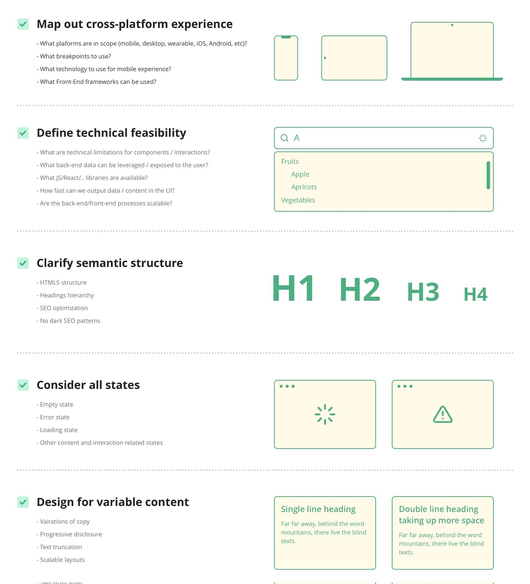
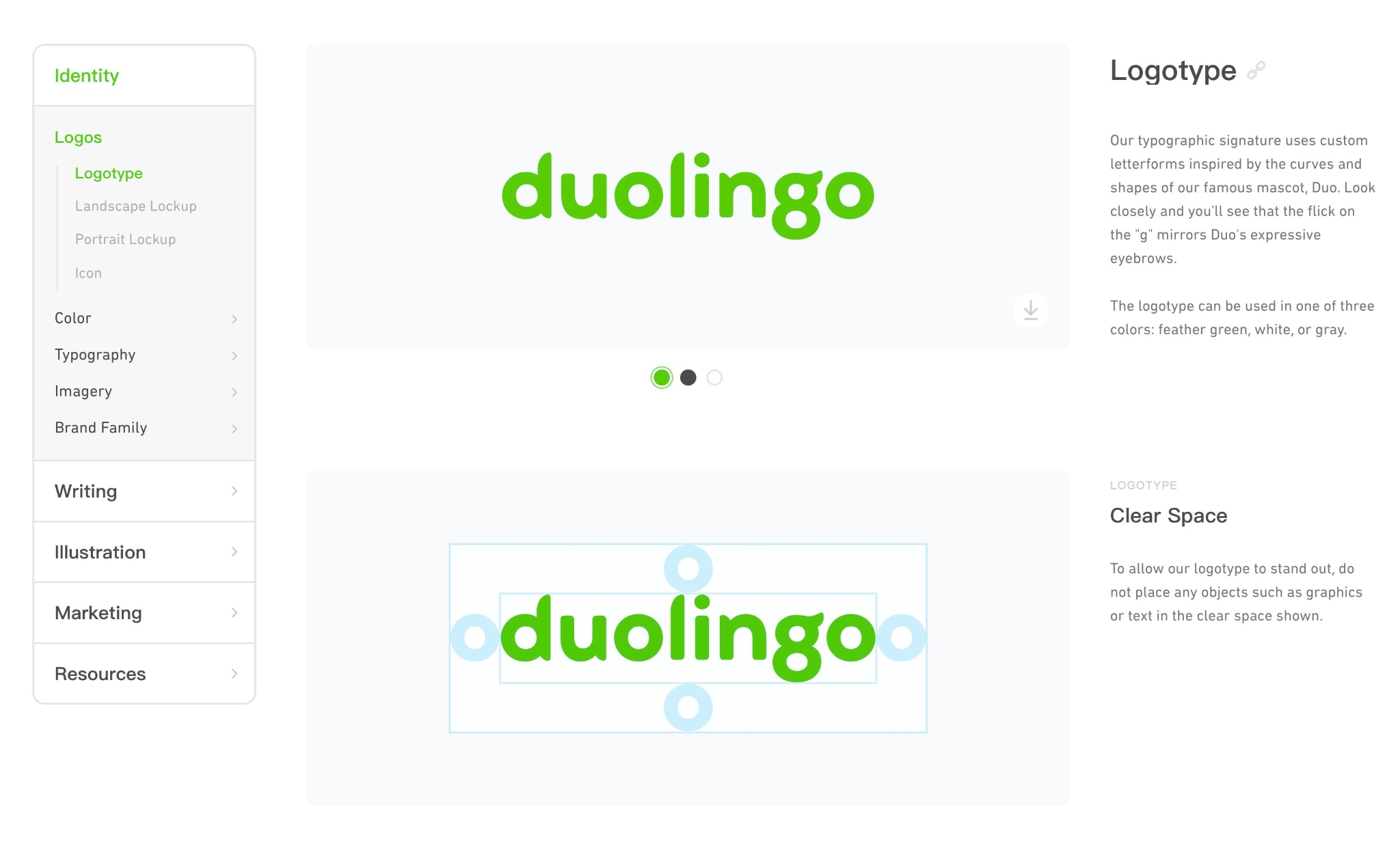
But using modern techniques or elements doesn't necessarily mean clashing with a fantasy setting. What I love is how comfortably Tears of the Kingdom brings flat design and its fantasy world together. Below, I'll introduce how it achieves this.
Communicating Information Efficiently and Clearly in Video Game UI
HUD
HUD (Head-up-Display), generally translated into Chinese as “抬头显示”
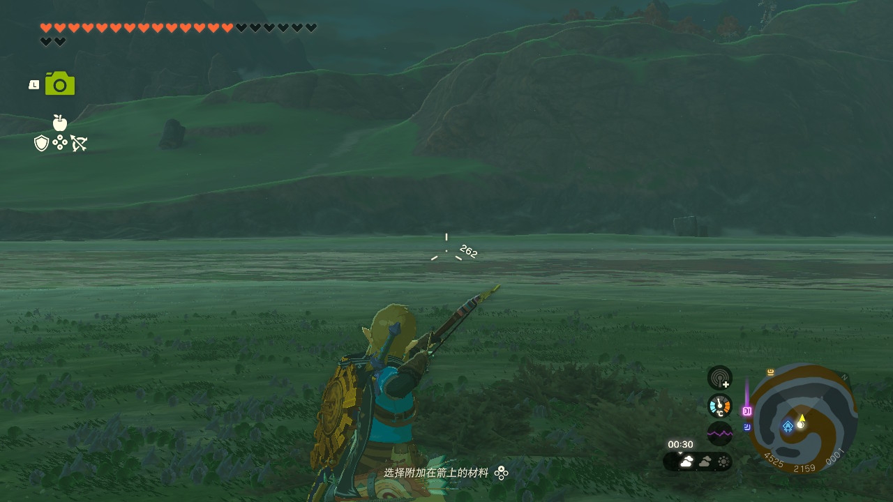
Designing a HUD is actually no easy task. The game visuals themselves are already rich, and we have these expectations for a game's HUD:
-
It should be easy to read most of the time.
-
An overly complex HUD can conflict with the immediacy a game requires, preventing players from getting the information they need right away.
-
-
There should never be a situation where it can't be read. Even if it isn't easy to read, we still want players to be able to take in the information.
-
Imagine a player forced into a particular camera angle where the HUD happens to blend into the background, just when they need the information it displays. We can't predict everything that will happen to players in a game, so it's best to provide a fallback.
-
-
The HUD shouldn't distract players.
-
Many games automatically hide the HUD when it isn't needed.
-
-
HUD design also needs to be considered together with the game's rendered visuals.
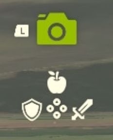
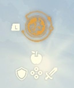
Here's how Tears of the Kingdom does it. Some of its HUD uses bright, solid-color icons with subtle shadows:
-
The brightness of the rendered world in Tears of the Kingdom is tightly controlled. In the vast majority of situations, the scene is darker than the HUD's bright colors, ensuring that players can easily read the HUD most of the time.
-
On the other hand, even against very white areas of the image, players can still read the HUD thanks to its subtle shadows.
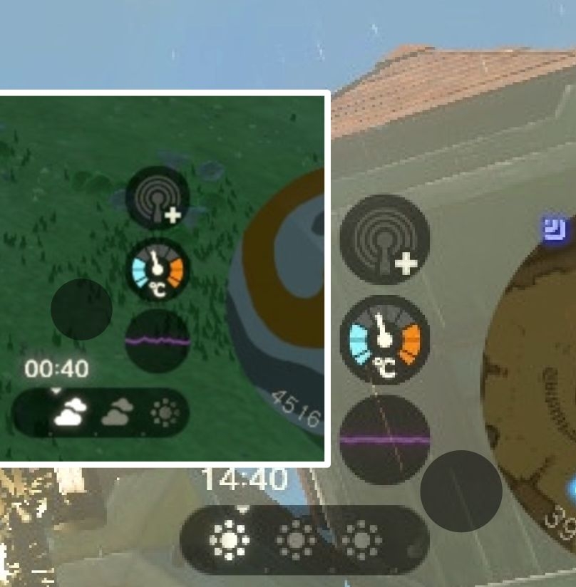
Other parts of the HUD use a semitransparent black background with bright colors, a fairly common design approach. (The extra black circle on the right is the result of my attempt to verify the blending mode in design software; I confirmed that it's normal blending.)
25% Pure Black ≠ 75% Dark Gray
On the subject of black overlays, it's worth mentioning that overlaying gray produces a noticeably different result from overlaying black at very low opacity. This is easy to see from the formula for normal alpha blending.
result = t * up + (1 - t) * downAs shown on the right, to achieve an overlay with a similar gray level against this background, the dark gray needs 75% opacity, losing most of the information in the image underneath. Black only needs 25% opacity, preserving more of the background's information.
So a low-opacity black overlay more easily creates a sense of transparency.
In short, when blending colors with transparency, we need to choose the gray level according to the effect we want. A similar principle applies when overlaying white.
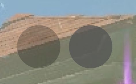
25% #000000 ← → 75% #525252
Making Flat Design Less Boring
Tears of the Kingdom uses a lot of flat design. Although flat design is very good at communicating information, it can indeed feel boring. I think the following design elements make its UI interesting. These details often aren't conspicuous, but together, they make the UI interesting without sacrificing the simplicity of flat design.
Blur
Blur is fairly common in the GUI design of Tears of the Kingdom. Combined with semitransparent black, it can create a pleasing sense of transparency while helping players focus on the GUI.
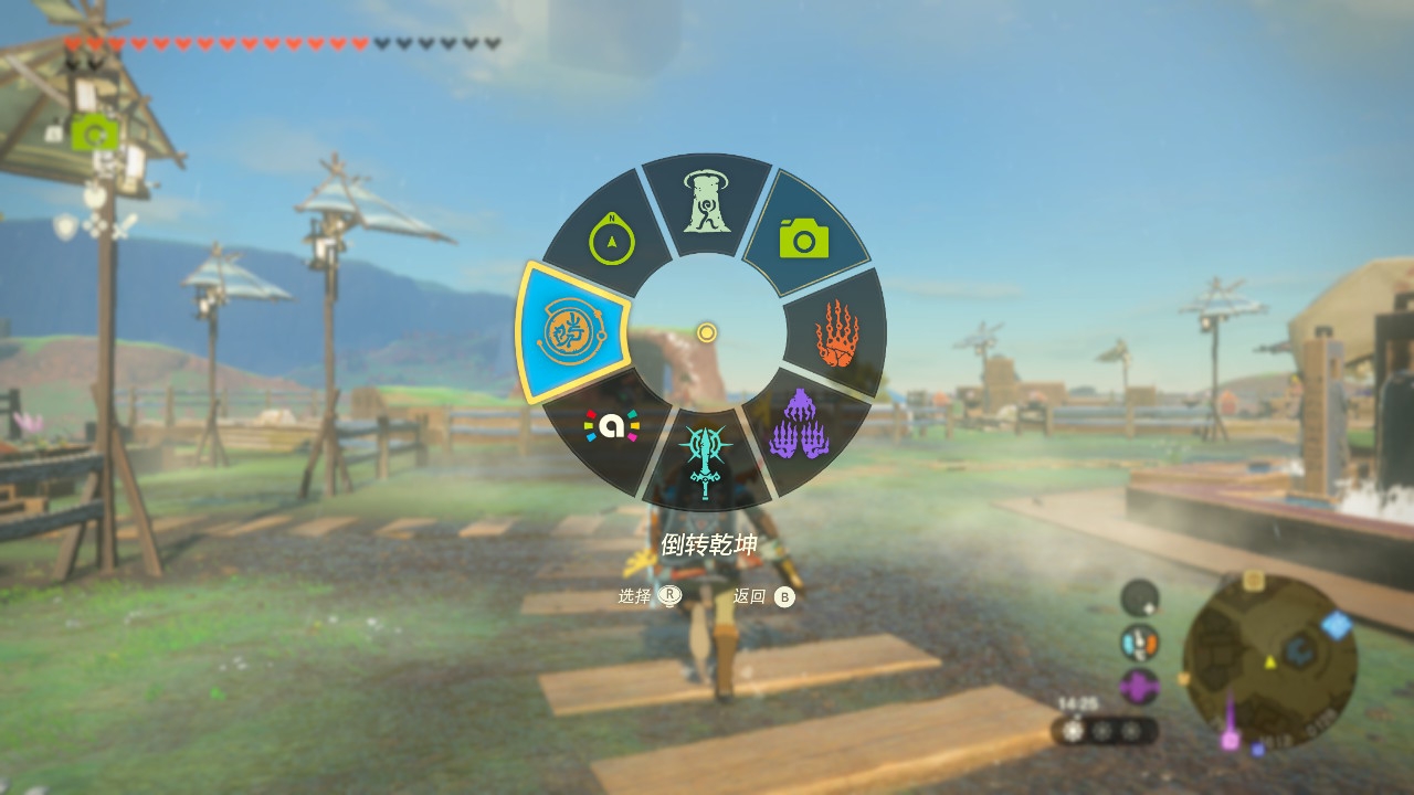
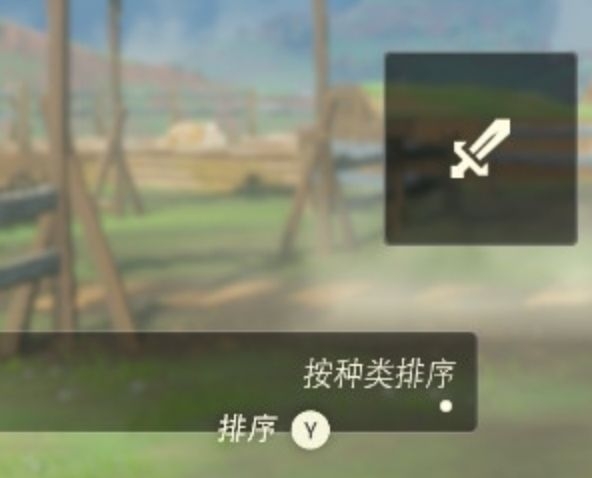
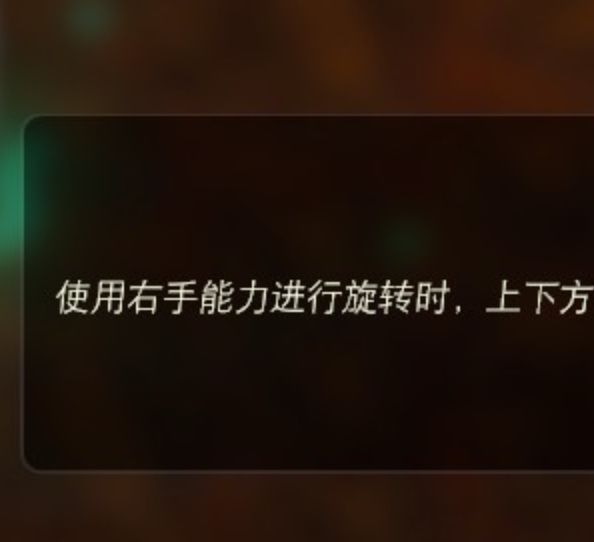
Blur is a somewhat constrained effect in video games: larger blur effects (convolution kernels) cost more. In Tears of the Kingdom, the game is paused while the GUI is open, so only the blurred result of the last frame before pausing needs to be rendered. This doesn't incur much overhead.
An article about speeding up blur rendering in video games: https://www.gamedeveloper.com/programming/four-tricks-for-fast-blurring-in-software-and-hardware
Glow & Shadows
Glow is another of Tears of the Kingdom's design themes. It fits the game's setting and also makes the UI more interesting.
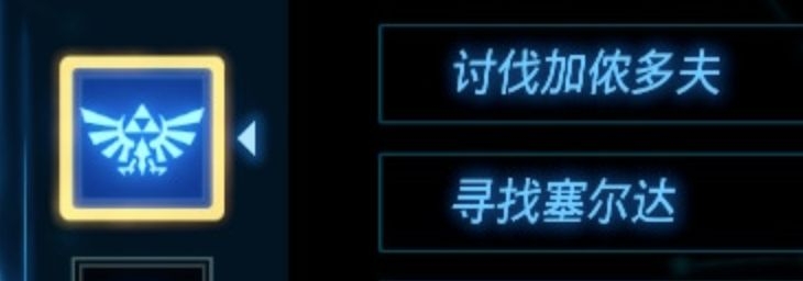
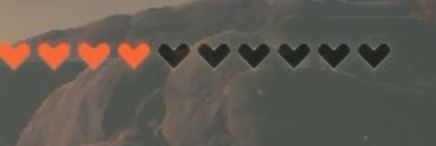
Fun fact: there's a glow around the hearts
Here's a fun fact: at night or in dark surroundings, parts of the HUD appear to glow; during the day, the effect is a shadow instead.
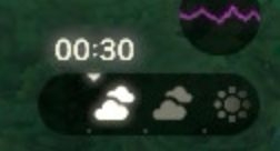
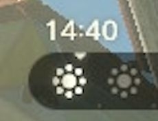
Shadows and glows are essentially the same thing, just in different colors. They're implemented using a Signed Distance Field, or SDF.
A simple rule in graphic design is that shadows stand out against light backgrounds, so their opacity is generally very low. Conversely, shadows are hard to see against dark backgrounds, so if you want them to be visible, you need to increase their opacity. Glow works similarly.

A shadow against a light background

A shadow against a dark background

Glow against a dark background
Patterns
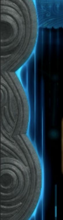
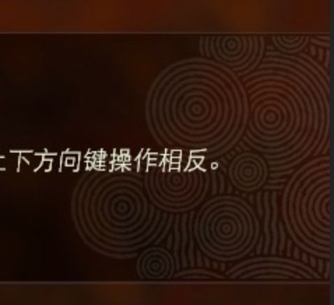
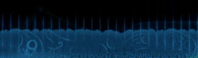
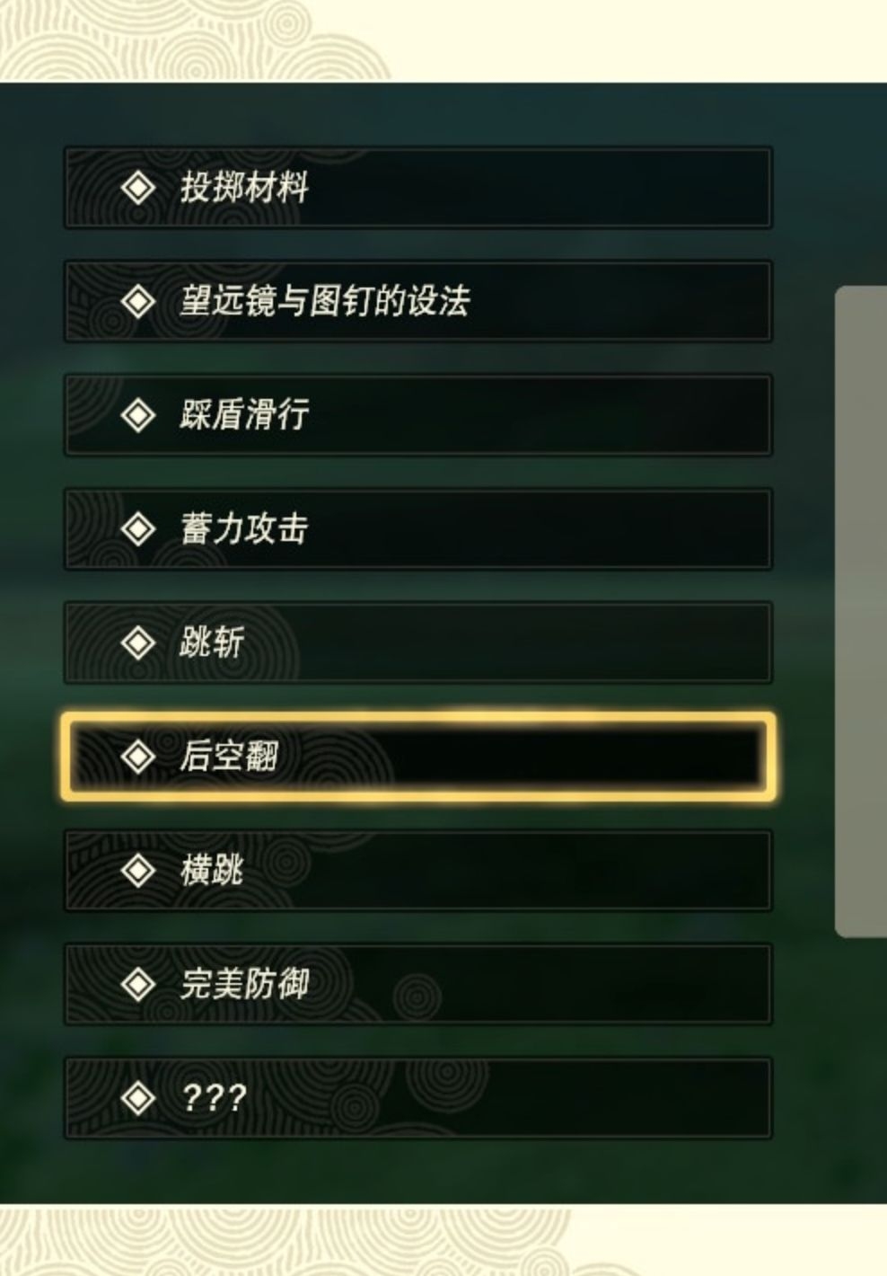
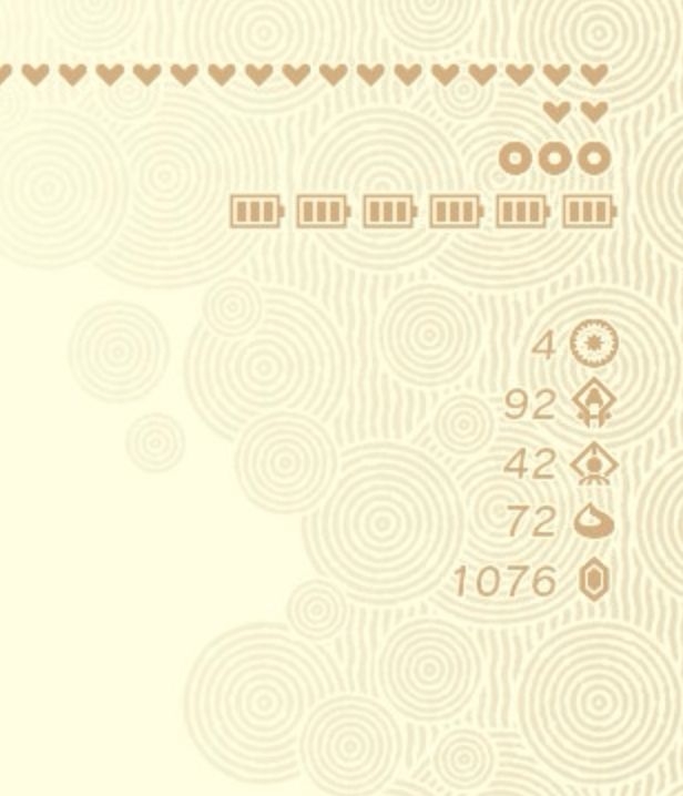
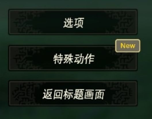
I think patterns are a very charming part of Tears of the Kingdom's design. They give its overall graphic design a character tied to the game's themes while enriching its visual elements. But I don't have the relevant expertise to explain them, so I'll just show them here.
Inset Strokes with a Gap
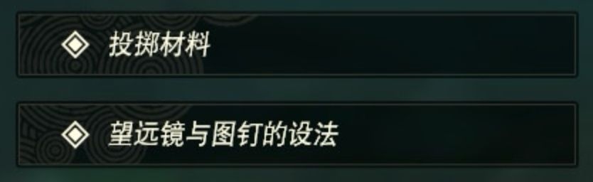
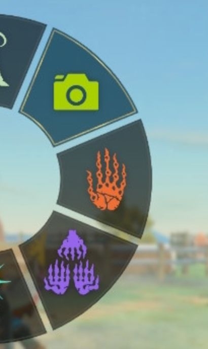
Tears of the Kingdom's UI often uses very thin strokes to emphasize UI elements or add detail to them.
Closing Thoughts
There's a lot more I'd like to say, but my own limited ability and the limited time I had to put this presentation together meant I didn't get the chance. For example, I also like Tears of the Kingdom's color design, typography and layout, information hierarchy, UI consistency, UI animation, UI sound effects, and so on. I think it's an excellent textbook for game UI design—or rather, most of Nintendo's first-party games are. In a similar style, Super Mario Odyssey's graphic design also leans toward flat design while remaining full of fun. Kirby and the Forgotten Land does too. You can clearly feel that Nintendo's game graphic design has modernized, and I think every Nintendo first-party title has something to teach us about making the flat elements of modern aesthetics interesting.